
Responsive Navbar with example
A responsive navbar is a navigation menu on a website that is designed to adjust its layout and design to fit different screen sizes and devices.
When a website is accessed on different devices such as desktops, laptops, tablets or smartphones, the screen size varies significantly. A responsive navbar ensures that the navigation menu is easily accessible and user-friendly, regardless of the device being used.
In general, a responsive navbar appears as a horizontal bar on desktop devices, which may be fixed or sticky, and can be placed at the top or bottom of the screen. On smaller devices like smartphones, the same navbar may appear as a dropdown menu that can be accessed by tapping on a hamburger icon.
Responsive navbars can be built using a variety of web technologies, including HTML, CSS, and JavaScript. There are also several frameworks and libraries, such as Bootstrap and Materialize, that provide pre-built responsive navbar components that can be easily customized to fit your website's design.
Overall, a responsive navbar is an essential component of a modern website, as it provides an intuitive and user-friendly navigation experience on all devices, and helps to improve the overall user experience of your website.
index.html
<!DOCTYPE html>
<html lang="en">
<head>
<meta charset="UTF-8">
<meta http-equiv="X-UA-Compatible" content="IE=edge">
<meta name="viewport" content="width=device-width, initial-scale=1.0">
<title>Responsive Navbar</title>
<link rel="stylesheet" href="style.css">
<link rel="stylesheet" href="https://cdnjs.cloudflare.com/ajax/libs/font-awesome/4.7.0/css/font-awesome.min.css">
</head>
<body>
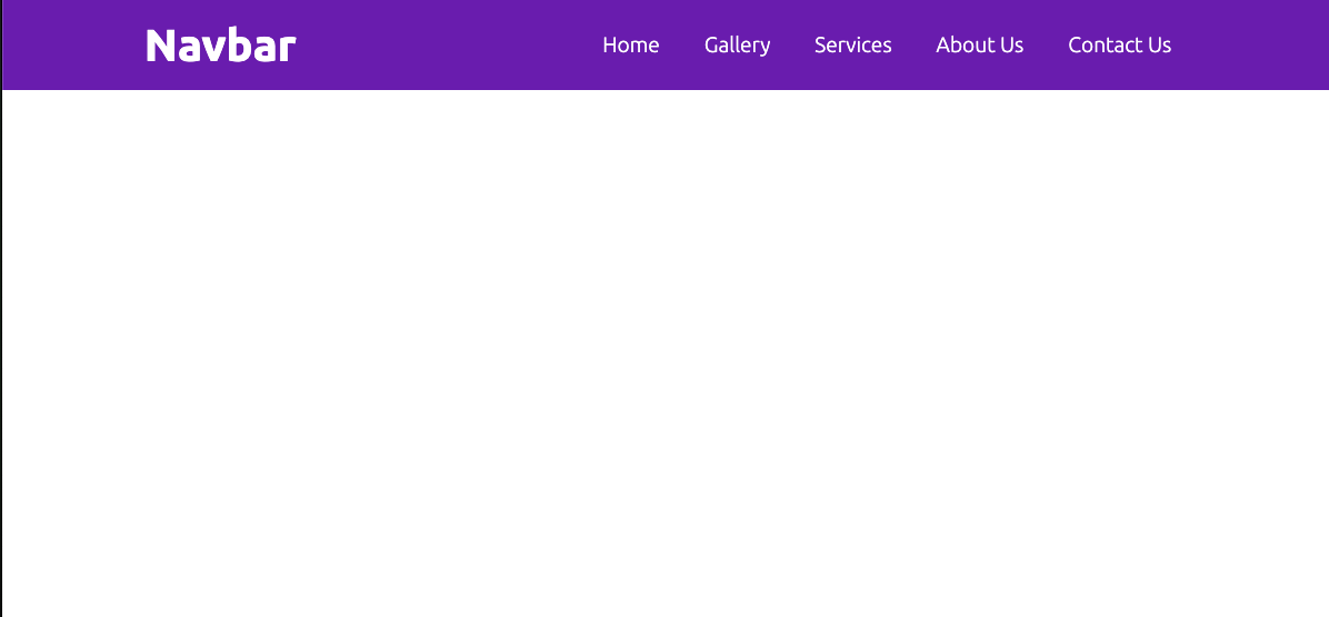
<nav class="navbar">
<div class="left">
<h1>Navbar</h1>
</div>
<div class="right">
<input type="checkbox" id="check">
<label for="check" class="checkBtn">
<i class="fa fa-bars"></i>
</label>
<ul class="list">
<li><a href="#">Home</a></li>
<li><a href="#">Gallery</a></li>
<li><a href="#">Services</a></li>
<li><a href="#">About Us</a></li>
<li><a href="#">Contact Us</a></li>
</ul>
</div>
</nav>
</body>
</html>
style.css
@import url('https://fonts.googleapis.com/css2?family=Poppins&family=Ubuntu:wght@300;700&display=swap');

* {
    margin: 0;
    padding: 0;
    box-sizing: border-box;
    color: #fff;
    font-family: 'Ubuntu', sans-serif;
}

.navbar {
    background-color: rgb(102, 17, 181);
    display: flex;
    justify-content: space-around;
    align-items: center;
    line-height: 5rem;
}

.left h1 {
    font-size: 2.5rem;
    cursor: pointer;
}

.checkBtn {
    display: none;
}

#check {
    display: none;
}

.checkBtn {
    cursor: pointer;
    font-size: 30px;
    float: right;
    color: #ed1e79;
    line-height: 80px;
}

.right ul {
    display: flex;
    list-style: none;
}

.right ul li a {
    padding: 10px 20px;
    font-size: 1.2rem;
    color: white;
    cursor: pointer;
    text-decoration: none;
    transition: all 1s;
}

.right ul li a:hover {
    background-color: #fff;
    border-radius: 7px;
    color: rgb(22, 7, 36);
}

@media screen and (max-width:805px) {
    .list {
        width: 100%;
        height: 100vh;
        background-color: rgb(22, 7, 36);
        text-align: center;
        display: flex;
        flex-direction: column;
        position: fixed;
        top: 4rem;
        left: 100%;
        transition: all 1s;
    }

    #check {
        display: none;
    }

    .checkBtn {
        display: block;
    }

    #check:checked~ul {
        left: 0%;
    }

}
Output


 Posts
Posts


Post a Comment
0 Comments